Visualizations
A collection of some of my favorite data visualizations I have made. All my visualizations are made in R, utilizing {ggplot2}, {tidyverse}, and other packages. Below are my visualizations from #TidyTuesday and the #30DayMapChallenge.
#TidyTuesday Plots
#TidyTuesday is a weekly challenge hosted by the R for Data Science community where participants create a visualization from a unique data set every week. Listed below are my entries. Click the image for an enlarged version.
All my #TidyTuesday visualizations and code can be found on my Github here.


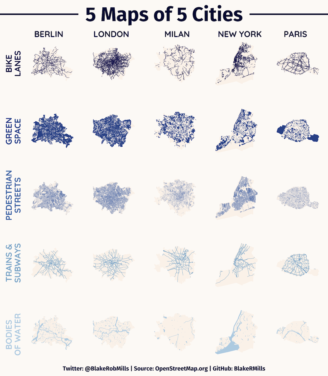
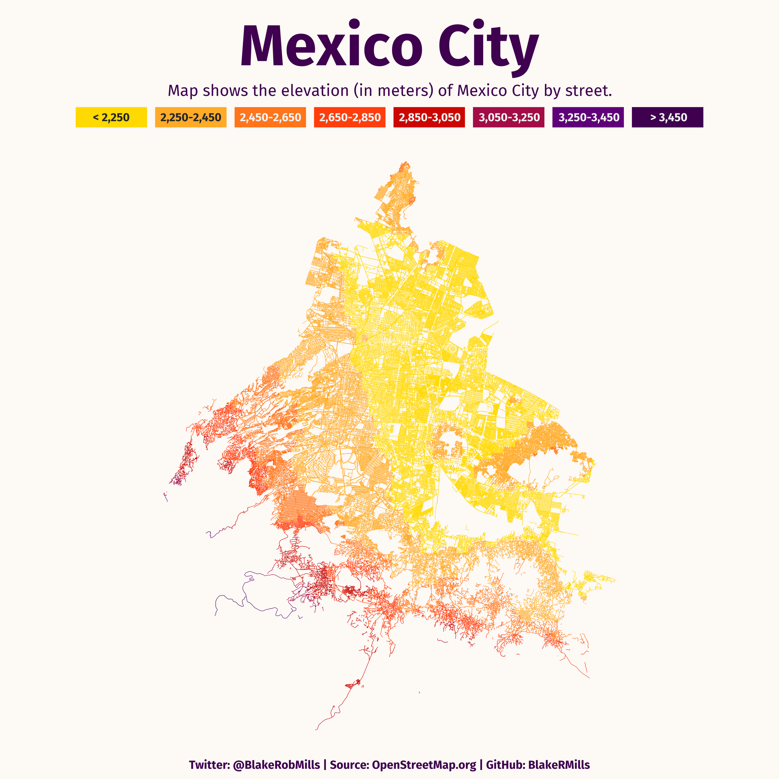
#30DayMapChallege
The #30DayMapChallenge is a project started by Topi Tjukanov where participants make a themed map everyday in the month of November. Below are some of my selected entries. Click on each map to open the full-size version of them in a new tab.
All my #30DayMapChallenge visualizations and code can be found on my Github here.
City Maps by Streets


Staying on my Street - Costs of Airbnbs


City Streets by Elevation


HOLC Redline & Police Killings


Other Entries

Lines

Hexagons

Boundaries

Historic

Natural Earth

Population

Red

Monochrome